SVGs can be surprisingly finicky when it comes to browser support. I recently ran into some interesting issues at work, specifically with Firefox, and realized: this wasn’t the first time I had Firefox SVG issues. The inconsistencies aren’t very well documented, so if you run into these bugs, just know you’re not alone. With SVGs you always need to cross browser test, especially since they’re usually a prominent part of a user interface.
#1: Gradient Fills
The humble gradient fill — very trendy, often subtle, and usually adds a nice little bit of depth to an otherwise flat UI. I love gradient fills on icons and backgrounds, and recently had the pleasure of implementing them in an icon system similar to the one I wrote about not too long ago. This created <symbol>s from icons included in a directory and combined them into an SVG sprite (an important note for the issue ahead). I also recommend read that post first to familiarize yourselves with symbol-sprite SVGs because they’re great.
Let’s start with what is possible in every modern browser: editing any SVG’s fill to be a solid color via CSS. Feel free to play with this demo here:
Sweet! So with solid colors, we have no issues, but with gradients, the story gets a bit trickier. You can’t simply apply CSS gradients like linear-gradient(red, yellow). However, there is a space within SVGs specifically designed for these sorts of use cases. It’s called the <defs> tag, where you can define properties. Within <defs>, we can create a variety of transformations (we can even cross-reference blocks inside of <defs>!) and access them via their IDs.
So inside of the SVG, we add:
<defs>
  <linearGradient id="gradient--primary">
    <stop offset="0" stop-color="#ff69b4"/>
    <stop offset="1" stop-color="#9f0547"/>
  </linearGradient>
</defs>
And we can access it like so:
Note: this url is implemented as an in-page reference, with the SVG being included on the page. You can also reference external SVGs which are not on the page via routing like fill: url(../images/sprite.svg#gradient--primary).
Back to the issue! The issue was the symbol-sprite system. I originally used a separate file for the <defs> I wanted included, which worked fine in Chrome and Safari, but the bug was brought to light in Firefox. You can’t include <defs> in your icon files or make make a separate file for all of your SVG <defs> because it will turn this file into a <symbol> with the <defs> inside of it. The solution I came up with was to include a separate svg file for the <defs> that didn’t run through the symbol sprite system and include it on the page in the same partial.
Other solutions include running through your SVG code via JavaScript and removing any <defs> from inside of <symbol> and rearranging them as needed.
#2: Blocky Appearance
The next major “wat” you may face is seeing blocky icons. I was stumped when these worked beautifully in Chrome and Safari but broke in Firefox and IE.
Help! SVG friends!
— Una Kravets (@Una) July 20, 2016
Anybody know why an expanded SVG looks fine in Chrome & Safari but completely broken in Firefox? pic.twitter.com/4uAoZeVIOm
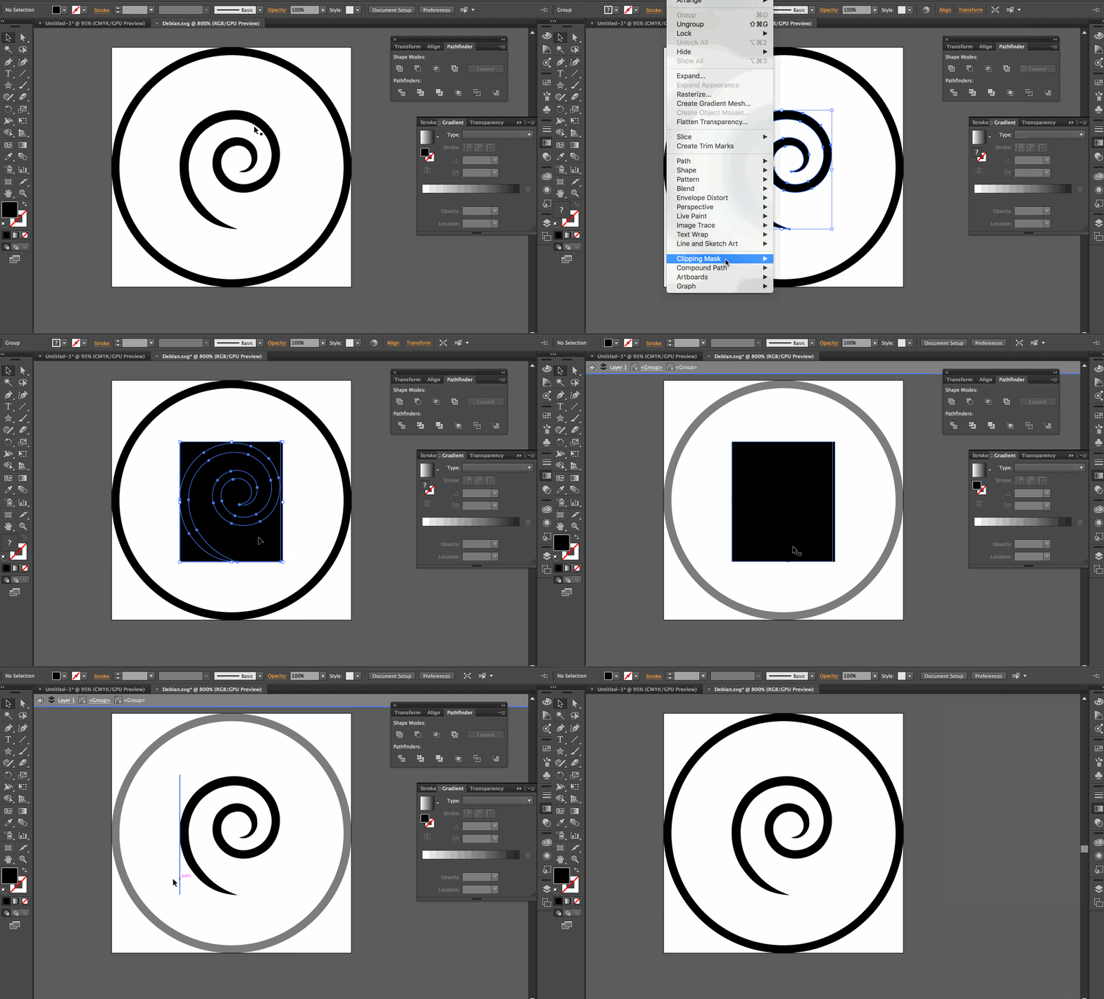
After some digging, it turns out the issue was not with an SVG property itself, but with a property called clip-mask (shout out to @JacobArriola for figuring that out). This occurs in a vector editing program, when a designer uses the “Clipping Mask” method to overlay an image and build a mask of it in the SVG.
Unfortunately, the only way to fix this is to go into the SVG document itself and remove the clipping mask. In most cases this mask is unnecessary once the SVG is expanded. The manual process looks like this:

#3: Transform Origin
A final (third because 3’s are nice) Firefox-weirdness I remember dealing with was with animations — the transform-origin did not work in Firefox like it did in Chrome and Safari. This bug has since been fixed in Version 42+ of Firefox, but please note that version 42 was released only 8 months ago, in November of 2015, so this may still be something you need to take care of and be aware of. There’s even a video about this bug and how to fix it.
Sara Soueidan also does a great job explaining this bug (and transform-origin) in her Fronteers talk:
Sara Soueidan - Animating SVGs with CSS and SMIL from Fronteers on Vimeo.
tl;dr: OMG please test your SVG graphics in multiple browsers