Performance. We hear about it often and talk about it plenty at developer conferences, but maybe we need to shift our focus to a different audience: designers. We already know that performance is a corner-stone to the success of our projects, and since media is the bottleneck to performance optimization, why aren’t we talking about it at design events? Why is performance typically not a priority in the design process? 99% of response time problems are still caused by the UI being too slow. [source]
Performance optimization is a team effort and we need to get the whole team on board instead of waiting for the point in the project where we’re developing the thing to double-back and fix our mistakes. We need to start prioritizing performance (and accessibility) as a part of the design process, because it is. Performance is a design challenge.
An Open Letter to Digital Designers:
Dear Web Designer, 💕
You have the power to make the Internet a faster, more accessible place. You can bring content to your users quickly and efficiently, and use load time efficiently. You affect the bottom line, right now, because performance is in your hands.
But it isn’t just about that bottom line. It’s about making an experience work seamlessly. It’s about saving humans from frustration, cognitive load, and the most valuable resources we have — time and money. (Yes, money — because websites can be more expensive to access than you realize).
You have such a big impact, and can literally make the web better for other humans. We need you!
💖 The People of the Internet
Win #1: Image Optimization
😱 During the last Olympics, the avg webpage was less than half the size it is today.
— Una Kravets (@Una) February 4, 2016
😬 Images have also doubled. pic.twitter.com/UshDN4KTb6
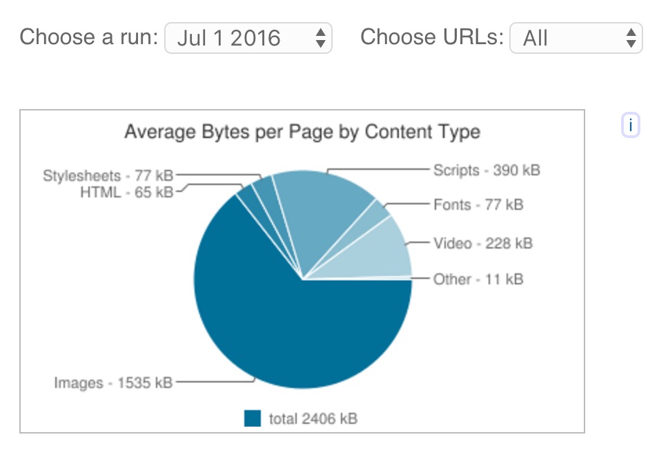
And other than fonts, the latest update is even worse (Charts sourced from HTTP Archive):

Images are the biggest “bang for your buck” performance win because media assets take up the majority of web resources [see diagrams above]. There are a few things you can do to make sure that the assets you are putting online are performant.
Never put an image on the web that hasn’t been optimized — Dave Rupert
The first is to choose the correct image format. Some formats are more performant than others in different use cases, so this could get tricky. I.e. for an icon containing a limited color range (2-5 colors), an svg or png may be ideal. A photo with a wide range of color is more performant as a jpg. The best way to test an image is to “save for web” in a program such as Photoshop and try out various image formats and compressions. Once you’ve determined the media format, compress it! And as a bonus, consider using a lazy loading technique to improve UI load time.
For a general reference, here’s a great flowchart by (the really talented) Sarah Drasner:
See the Pen Animated Flow Chart to demo animating viewBox by Sarah Drasner (@sdras) on CodePen.
Image Optimization Mini-Checklist
Win #2: Typography
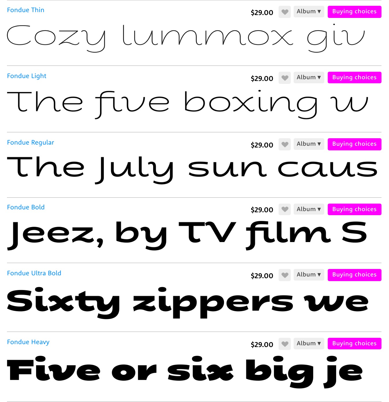
Typography is a key part of the identity of any company, and plays an important role in helping users parse a web page’s content more effectively. However, you may not realize the literal weight of every font weight (ha..ha.. ok I’m sorry about that one). Basically, every weight of every font of every style is another request and a heavier load on the page. For example, these would be six different requests for a single typeface:

Typography Optimization Mini-Checklist
Win #3: Active Waiting
No matter how much optimization you do, there will still be some delay in load time as assets roll in. This is where design becomes even more important in improving a website’s performance, and specifically in improving percieved performance — AKA how fast a user feels the website is loading. Is a lag noticeable?
“Progress bars are the hold music of the web. They highlight to the user that they’re waiting” – Tim Kadlec
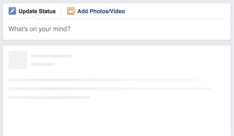
There is so much you can do to take advantage of this waiting time — also known as active waiting. Tim Kadlec gave a great talk on this subject where he highlighted some of the behavior that various companies do in this waiting time. For example, Facebook loads up blank divs where the content will go so the user is cued that content is coming, and visually primed to receive it.

This is akin to going to a restaurant for dinner. The table is set for food to arrive. We’re primed to receive it. When we arrive and there is no place setting, if we’re just sitting there with the menu and nothing else, it feels strange.
Viget, an agency based out of DC, did a study on the customized loading animation vs. generic experiences. They found that “Overall, the branded loading experiences as a group held participants’ on the loading page for longer, and had lower abandon rates than the non-branded, generic experiences.”
Active Waiting Mini-Checklist
TL;DR: Image optimization, typography consideration, and active waiting are all ways to improve performance as a designer