/* The Best JavaScript is No JavaScript */

/* The Best JavaScript is No JavaScript */

Una Kravets una.im
Google Chrome DevRel

Separate your application logic from your styling logic
  • Logical Components
  • CSS Math Functions (minmax(), clamp(), CSS trigonometry)
  • Container queries (@container, style())
  • Advanced selectors (:has(), :not())
  • CSS-Driven Interactions
  • Scroll-driven animations (view-timeline)
  • New component primitives (popover, anchor)
  • Native Architecture
  • Typed CSS (@property)

CSS Grid Functions

  • repeat()
  • auto-fit
    /auto-fill
  • minmax()
  • Chromium

    Mar 2017

  • Webkit

    Mar 2017

  • Firefox

    Mar 2017

1
2
3
4

CSS Math Functions

  • min()
  • max()
  • clamp()
  • Chromium

    Dec 2019

  • Webkit

    Mar 2020

  • Firefox

    Apr 2020

:clamp() responsive typography

I am fluid typography

CSS Trig Functions

  • sin()
  • cos()
  • tan()
  • Chromium

    Mar 2023

  • Webkit

    Mar 2022

  • Firefox

    Dec 2022

.item {
  --radius: calc(var(--btn-size) + var(--extra-space));
  background-color: var(--bg);
  transform: translateX(calc(cos(var(--angle)) * var(--radius)))
             translateY(calc(sin(var(--angle) * -1) * var(--radius)));
  transition: transform 0.3s var(--delay) ease;
}

Popover + Anchor positioning

popover attribute

Built-in accessibility semantics, keyboard behavior, tab focus management, and (optional) light-dismiss

  • Chromium

    May 2023

  • Webkit

  • Firefox

HTML

<!-- Button -->
<button popovertarget="my-popover">
Open Me
</button>

<!-- Popover -->
<div id="my-popover" popover>
Popover Stuff
</div>
<button popovertarget="my-popover">                  
  Open Popover 
</button>

<div id="my-popover" popover>
  <p>I am a popover with more information.<p>
</div>
<button popovertarget="my-popover">                  
  Open Popover 
</button>

<div id="my-popover" popover="manual">
  <button class="close-btn" 
      popovertarget="my-popover" 
      popovertargetaction="hide">
    <span aria-hidden=”true”>❌</span>
    <span class="sr-only">Close</span>
  </button>
  <p>I am a popover with more information.<p>
</div>

Animating popovers

  • :popover-open
  • @starting-style
  • Chromium

    Soon ⚠️

  • Webkit

  • Firefox

.settings-popover {
  &:popover-open {
    /*  0. BEFORE-OPEN  */
    @starting-style {
      transform: translateY(20px);
      opacity: 0;
    }
    
    /*  1. OPEN STATE   */
    transform: translateY(0);
    opacity: 1;
  }

/*  2. EXIT STATE   */
transform: translateY(-50px);
opacity: 0;

/*  List transitioning properties (w/ display) */
transition: transform 0.5s, 
            opacity 0.5s, 
            display 0.5s;
}
                    

Popover + Anchor positioning

anchor positioning

  • anchor=""
  • anchor()
  • @try {}
  • Chromium

    Soon ⚠️

  • Webkit

  • Firefox

HTML

<!-- Add an id -->
<button popovertarget="my-popover" id="toggle-btn">
        Open Me
</button>

<!-- Add an anchor -->
<div popover id="my-popover" anchor="toggle-btn">
        Popover Stuff
</div>

CSS

#profile-settings-popover {
  bottom: calc(anchor(top) + var(--spacer));
  right: calc(anchor(right));
}
[popover] {
  bottom: calc(anchor(top) + 1rem);
  right: calc(anchor(right));
}

I am a popover tooltip with more information. I am a popover tooltip with more information. I am a popover tooltip with more information. I am a popover tooltip with more information.

I am a non-popover anchored tooltip with more information. I am a non-popover anchored tooltip with more information. I am a non-popover anchored tooltip with more information. I am a non-popover anchored tooltip with more information.

<!-- Selectmenu -->

<selectmenu>
  <button slot="button" behavior="button">
    <label>Select a color</label>
    <span slot="selected-value" 
      behavior="selected-value" 
      class="selected-val"></span>
  </button>
  <option value="Red">
    <figure class="red"></figure>
    Red
  </option>
  <option value="Orange">
    <figure class="orange"></figure>
    Orange
  </option>
  <option value="Yellow">
    <figure class="yellow"></figure>
    Yellow
  </option>
  ...
</selectmenu>

:has() relational selector

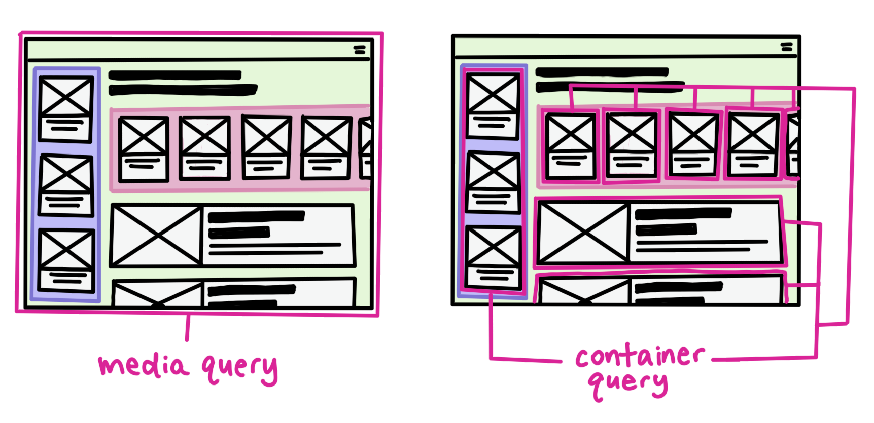
Style parent elements (and more) based on the presence or state of child elements

  • Chromium

    Aug 2022

  • Webkit

    Mar 2022

  • Firefox

    🏁

:has() relational selector

This figure doesn't have a figcaption. Lorem ipsum dolor sit amet consectetur adipisicing elit. Eveniet ipsam, ad delectus doloremque blanditiis in incidunt numquam eum ullam ut quo porro vel soluta deleniti rerum reprehenderit quae aliquid quos.

Chromium logo

This figure does have a figcaption. Lorem ipsum dolor sit amet consectetur adipisicing elit. Nostrum, aut. Minima natus nulla, dicta, quasi autem a architecto, earum explicabo molestias illum eum rerum magni! Harum sequi cumque quia expedita.

Quantity Queries

Style based on the number of children

:has(:nth-child(n + x))
  • Hair: Harry Potter
  • Makeup: Mark Zuckerberg
  • Styling: Mary Poppins
  • Hair: Harry Potter
  • Makeup: Mark Zuckerberg
  • Styling: Mary Poppins
  • Accessories: Marie Claire
  • Photographer: Beyonce
  • Photography Assistance: Leonardo DiCaprio

Container Queries

  • container-type
  • container-name
  • @container
  • Chromium

    Aug 2022

  • Webkit

    Sept 2022

  • Firefox

    Feb 2023

Micro-UI

Container query units

Powerpuff Girls Rule

Style Queries

  • style()
  • @container()
  • Chromium

    Mar 2023 ⚠️

  • Webkit

  • Firefox

@container style(--sunny: true) { .card { ... } } @container style(--sunny: true) and style(--cloudy: true) { .card { ... } }

Future

@container style(--rain) { .card { ... } } @container style(25% <= --rain <= 50%) { .card { ... } }

Made possible by... @property

  • Chromium

    Aug 2020

  • Webkit

    Mar 2023

  • Firefox

@property declaration

@property --colorPrimary {
  syntax: '<color>';
  initial-value: magenta;
  inherits: false;
}

@property Typed CSS

.card {
  background-color: var(--colorPrimary); /* magenta */
}

.highlight-card {
  --colorPrimary: yellow;
  background-color: var(--colorPrimary); /* yellow */
}

.another-card {
  --colorPrimary: 23;
  background-color: var(--colorPrimary); /* magenta */
}
@property --gradPoint {
  syntax: '<percentage>';
  inherits: false;
  initial-value: 40%;
}

.post {
  background: 
    linear-gradient(var(--color1) var(--gradPoint), 
                    var(--color2) calc(var(--gradPoint) + 20%));
  transition: --gradPoint 0.5s;
}

.post:hover, .post:focus {
  --gradPoint: 100%;
}

Scroll-driven animations

  • view-timeline
  • animation-timeline
  • view()
  • Chromium

    Soon ⚠️

  • Webkit

  • Firefox

@keyframes fly-in {
  0% {
      opacity: 0;
      transform: translateX(-100px);
  }
  50% {
      opacity: 1;
      transform: translateX(0px);
  }
}

blockquote {
  animation: fly-in auto linear;
  animation-timeline: view();
}
🤫 This presentation is fully built with vanilla CSS & HTML*

*with some iframes for demos due to laziness

<style> with display:block and contenteditable

Smooth scroll with scroll-snap

Navigation with HTML accesskey

  • ctrl + opt + 1 = Intro
  • ctrl + opt + 2 = Grid functions
  • ctrl + opt + 3 = Math functions
  • ctrl + opt + 4 = Trigonometric functions
  • ctrl + opt + 5 = Popover & Anchor
  • ctrl + opt + 6 = :has()
  • ctrl + opt + 7 = Container queries
  • ...

Another cool thing...

CSS & HTML work in every framework
The best way to level up your developer skillset is to get good at CSS and HTML
Leverage the browser
Don't underestimate CSS and vanilla HTML components

Thank you

Find me on the internet!

@una