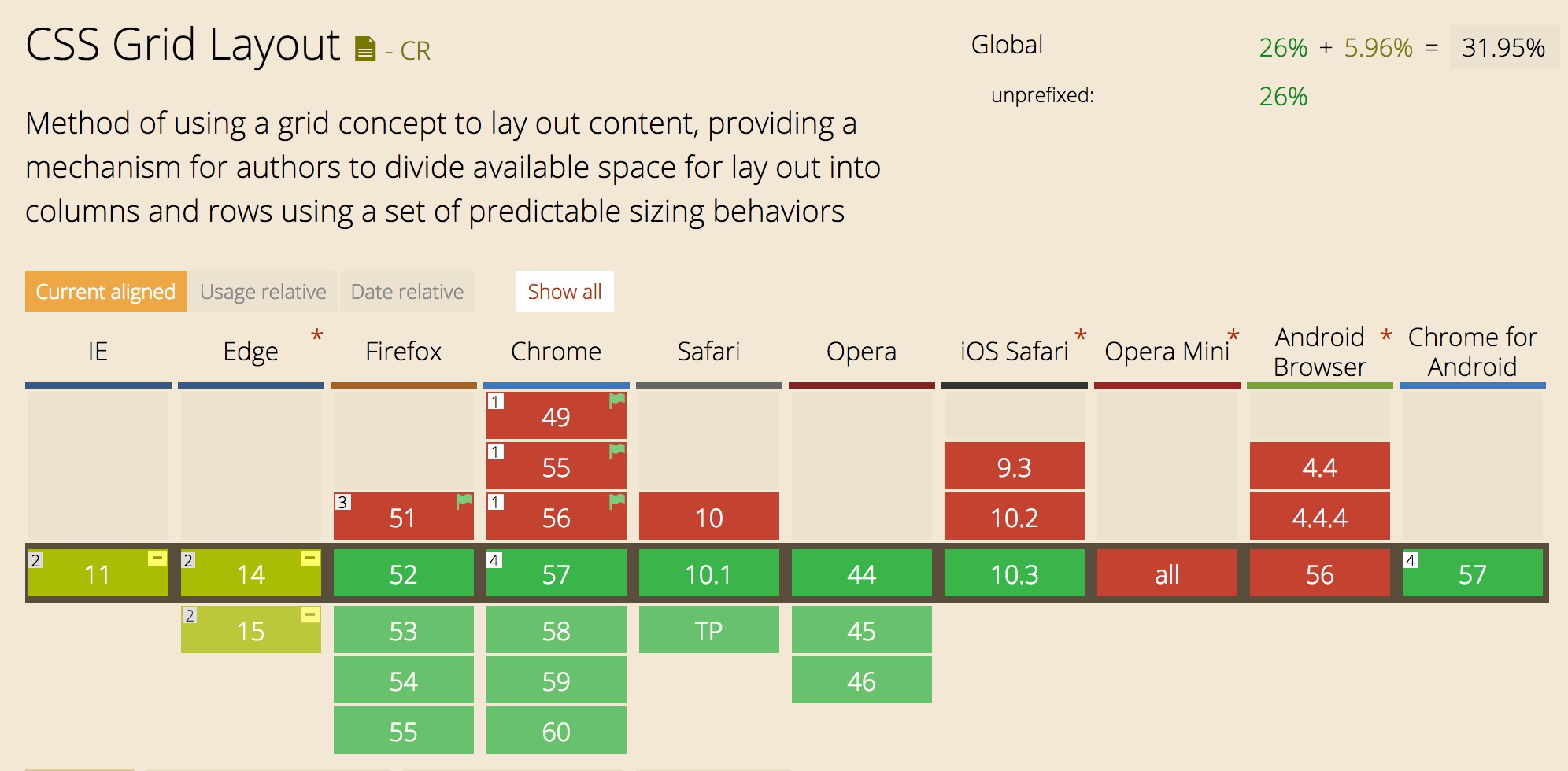
I’m having a hard time containing my excitement for CSS grid: a spec thats been in the works for a while, but is finally here! News of grid has been exploding in popularity on the web as its becoming increasingly implemented in browsers (upvote here for Edge). Firefox also just came out with a pretty sweet Grid editing view in its developer tools, and I imagine Chrome will soon, too.
Current support is as follows:

I had been hearing about grid for a while but never really understood its real potential until I actually used it. And oh my gosh is it going to make our lives so much better! CSS Grid is one of the most well-thought-out and powerful CSS specs I’ve seen in a long time.
Now, there are a lot of awesome tutorials and learning resources out there (linked at the bottom of this post), so this post isn’t going to be a full on how-to guide, but instead about why CSS grid is so good! Hopefully it’ll convince you to give it a try!
Named Areas
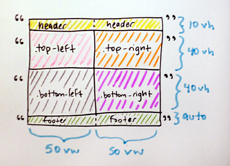
Grid has a few ways to lay out templates, including a new unit called the fr, or fractional, ala a fractional part of the space. My favorite part of the new templating features is grid-template-areas! This allows you to create named areas that correspond to grid-template-columns and grid-template-rows in your layout. You can literally write out a map of your design!
Take this example:
See the Pen CSS Grid + Flexbox Layout Demo with Fallback by Una Kravets (@una) on CodePen.
body {
    /* columns based at half
       the viewport width */
    grid-template-columns: 50vw;
    /* header + sections = set height
       but footer is auto-sized */
    grid-template-rows: 10vh 40vh 40vh auto;
    /* grid template areas here! */
    grid-template-areas:
      "header header"
      "top-left top-right"
      "bottom-left bottom-right"
      "footer footer";
  }
I KNOW, RIGHT!?
body {
    grid-template:
      "header header" 10vh
      "top-left top-right" 40vh
      "bottom-left bottom-right" 40vh
      "footer footer" / 50vw 50vw;
}body {
grid-template:
"👸 👸" 10vh
"↖️ ↗️" 40vh
"↙️ ↘️" 40vh
"👠 👠" / 50vw 50vw;
}Doing a refactor today and for kicks, I thought I'd try rewriting a Flexbox Grid using CSS Grid... Flexbox: 42 lines Grid: 5 lines
— Dave Rupert (@davatron5000) March 15, 2017
Fallbacks in flexbox are possible, but are a bit more hacky and require more lines of code. I’ve even found that writing layouts using CSS Grid first is a good paradigm for understanding how the layout itself flows, which then allows for easier writing of a Flexbox fallback, such as in the initial example.
Gutter the Way We Want it
CSS Grid implements grid-gap which creates a gutter between your elements. This is a problem we’ve been trying to solve for ages with responsive web design grids.
Previously, you would need to use margins for element spacing in your flexbox or float-based grid systems. This also meant weird hacks to remove the margins we don’t want (such as the ones around the sides, top, and bottom of our grid container).
These are some of the things we’ve tried in the past to solve this problem:
- First we had to use JavaScript to count up our elments and apply classes to remove these margins based on where they were in the spread
- Then, we used responsive grid frameworks, which were mostly percentage based, but we had to specify how many columns we had and what they would span
- Then, we tried to remove our outer margins with nth-children but that was very prone to error and brittle when the screen resized
- Eventually
calcwas introduced for grid gutters due to the ability to mix units (100% - gutters), but the code was still pretty hacky, and either needed to know how many items were in the row, or used negative positiong hacks andoverflow: hiddenon the outside gutters
My point is: CSS grid fixes all of this. It places gutters between elements where they’re most commonly intended to be in one line of very clear and concise CSS.
Minmax
With grid comes minmax(), a CSS function that allows you to set a minimum width (or height) and a maximum width (or height) to a containing element. If you’re like me, you’re already thinkig: “Uhmm… WHAT?! YES. FINALLY”, but you’re probably less nerdy about this kind of stuff than me 🤓 You can use:
- Any fixed unit (i.e.
px,em,vw, etc.) - Grid units (i.e.
1fr) - Percentages (i.e.
40%) min-contentmax-contentauto
There is a lot of power in a few lines of code right here, and allows for elements to be flexible within their grids but at a certain point stop decreasing/increasing in size. That means you might not need media queries and even better, it brings us one step closer to element queries where elements flex based on the size of their individual container and not the size of the browser window.
An example is as follows:
See the Pen CSS Grid + Flexbox Layout Demo -- minmax by Una Kravets (@una) on CodePen.
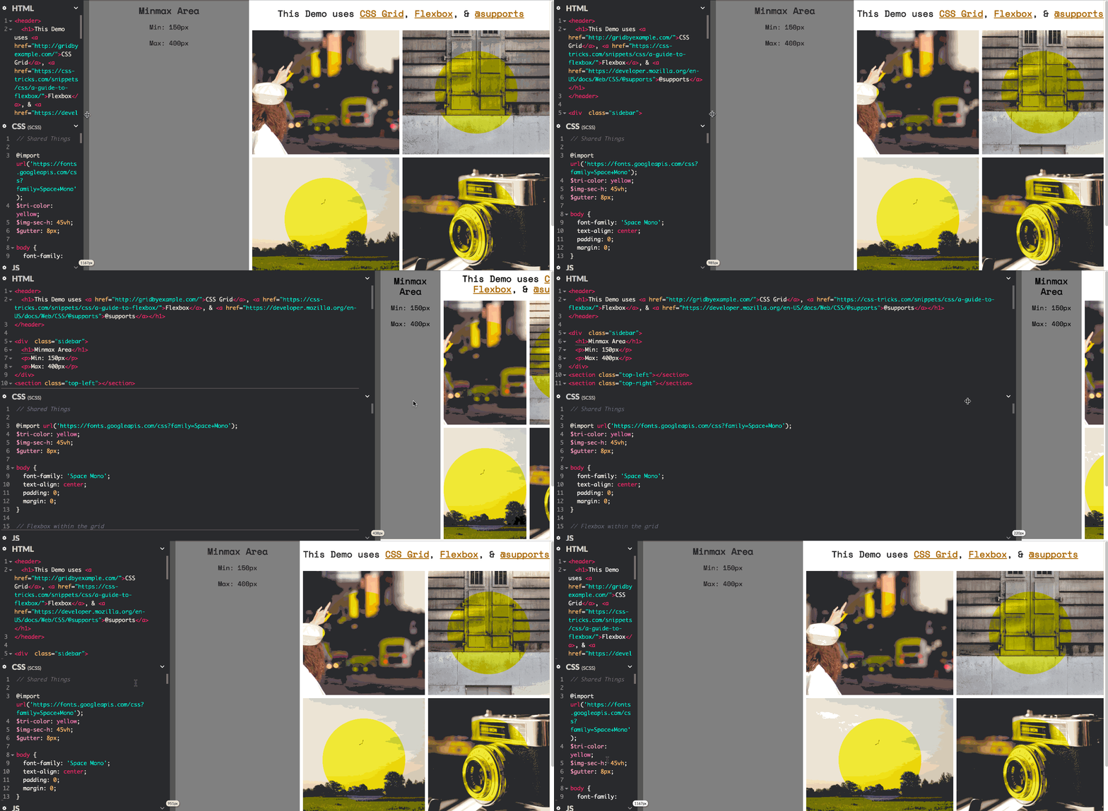
That demo doesn’t include a fallback yet, so here’s a gif of what that should look like if you’re not on the latest browser:

Minmax + Auto flow means you can make some really awesome layouts. In the example above, the larger content area was set to auto flow while the sidebar has a minmax constraint. The entire grid, with a header and content body next to a sidebar but separated from the footer, looks like:
body {
  display: grid;
  grid-gap: $gutter;
  grid-template-columns: minmax(150px, 400px) auto;
  grid-template-rows: 10vh $img-sec-h $img-sec-h auto;
  grid-template-areas:
    "side     header       header"
    "side     top-left     top-right"
    "side     bottom-left  bottom-right"
    "footer   footer       footer";
}
I didn’t have to set widths on individual elements or use calc or anything! And did I mention since it’s CSS Grid it works both horizontally and vertically for rows and columns!? 🎉🎉🎉
Conclusion
The CSS grid spec provides a lot of powerful features for developers and designers, and will make layout on the web immensely easier and much more semantic. It just works, and I’m almost angry it’s so easy.
Also note that CSS Grid isn’t a replacement for Flexbox. They work together in unison. Since Flexbox is a linear layout property, it can work well within a grid system, but isn’t the best solution to page layouts, which are both horizontal and vertical. They work together to make layout a dream.
Learn CSS Grid
Take some time to explore these resources and find out what all of the hype is about.
- http://gridbyexample.com/
- https://cloudfour.com/thinks/first-css-grid-layout/
- http://labs.jensimmons.com/
- https://www.mozilla.org/en-US/developer/css-grid/
- https://alistapart.com/article/practical-grid