Better, Faster, Stronger Web UI
Una Kravets ♥ una.im
Web UI has been evolving faster than ever
Better UI capabilities Faster performance benefits Stronger resilient components
Separate your application logic from your styling logic
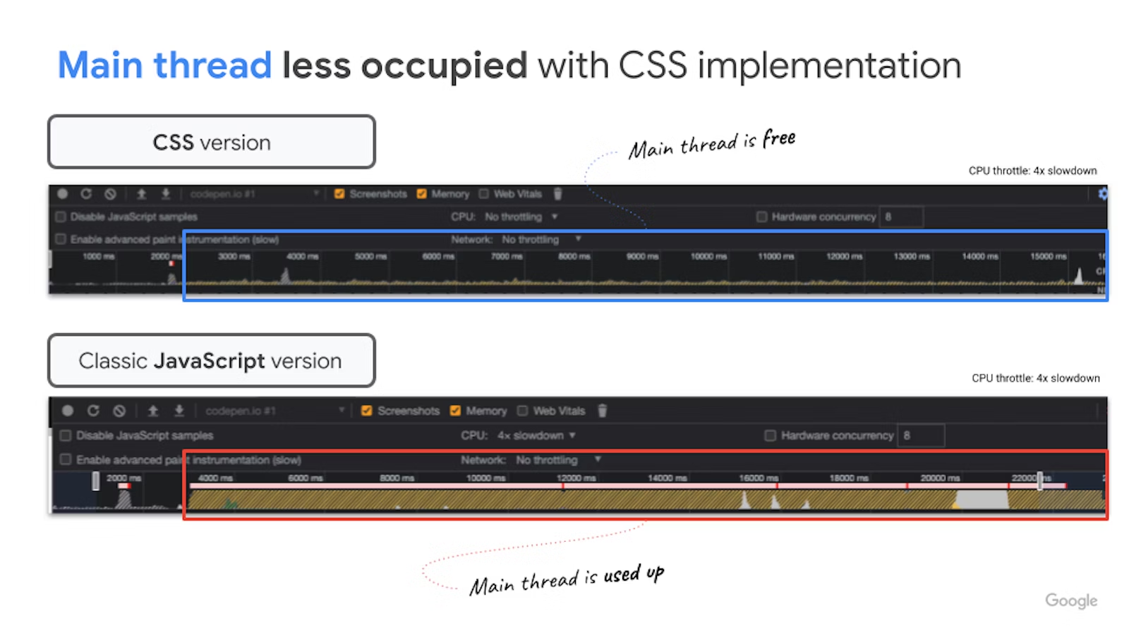
Stop writing unnecessary, heavy, thread-blocking JavaScript
popover attributeBuilt-in accessibility via keyboard behavior, tab focus management, top-layer support, and (optional) light-dismiss
May 2023
September 2023
May 2024 (soon)
RIP React Portals
HTML
                  <!-- Button -->
<button popovertarget="my-popover">
  Open Me
</button>

<!-- Popover -->
<div id="my-popover" popover>
  ... Popover Stuff ...
</div>
<button popovertarget="my-popover">
  Open Popover
</button>

<div id="my-popover" popover>
  <p>I am a popover with more information.<p>
</div>
<button popovertarget="my-popover">
  Open Popover
</button>

<div id="my-popover" popover="manual">
  <button class="close-btn"
      popovertarget="my-popover"
      popovertargetaction="hide">
    <span aria-hidden=”true”>❌</span>
    <span class="sr-only">Close</span>
  </button>
  <p>I am a popover with more information.<p>
</div>
Animating popovers
:popover-open@starting-styleallow-discreteoverlay
.settings-popover {
  &:popover-open {
    /*  0. BEFORE-OPEN  */
    @starting-style {
      transform: translateY(20px);
      opacity: 0;
    }

    /*  1. OPEN STATE   */
    transform: translateY(0);
    opacity: 1;
  }

/*  2. EXIT STATE   */
transform: translateY(-50px);
opacity: 0;

/*  Transitioning properties + allow-discrete */
transition: transform 0.5s,
            opacity 0.5s,
            display 0.5s allow-discrete;
}
// JavaScript

deleteListItem() {
  const listItem = this.parentNode;

  listItem.classList.add('is-deleting');
  setTimeout(() => {
    listItem.parentNode.removeChild(listItem);
  }, 500);
}
/* CSS */

.item {
  opacity: 1;
  transform-origin: bottom;
  transition: opacity 0.5s,
              transform 0.5s,
              display 0.5s allow-discrete;
}

@starting-style {
  .item {
    opacity: 0;
    height: 0;
  }
}

/* while deleting, before DOM removal in JS */
.is-deleting {
  opacity: 0;
  display: none;
  transform: skewX(50deg) translateX(-25vw);
}
anchor positioning
anchor=""anchor()@position-try {}inset-areaflip-x/y
HTML
                  <!-- Add an id -->
<button popovertarget="my-popover" id="toggle-btn">
        Open Me
</button>

<!-- Add an anchor -->
<div popover id="my-popover" anchor="toggle-btn">
        Popover Stuff
</div>
anchor()
                  #profile-settings-popover {
  bottom: calc(anchor(top) + var(--spacer));
  right: calc(anchor(right));
}
inset-area
                  #profile-settings-popover {
  inset-area: top span-left;
}
una.github.io/anchor-tool/
[popover] {
  position: absolute;
  inset-area: top span-left;
  margin-bottom: 1rem;
}
Position try options
Auto flip position try keywords
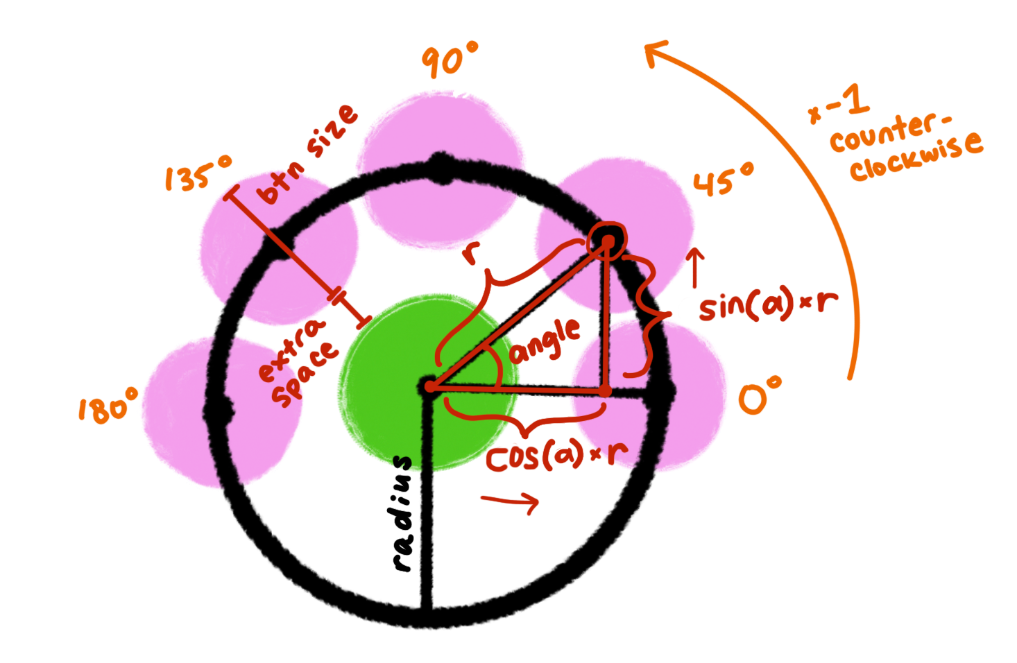
Popover + Anchor positioning + CSS Trigonometric Functions
.item {
--radius: calc(var(--btn-size) + var(--extra-space));
background-color: var(--bg);
transform: translateX(calc(cos(var(--angle)) * var(--radius)))
           translateY(calc(sin(var(--angle) * -1) * var(--radius)));
transition: transform 0.3s var(--delay) ease;
}
popover has no default semantic role
Menu: role="menu"
Tooltip: role="tooltip"
Dialog: dialog element
Selection: selectlist element 👩🏼🔬
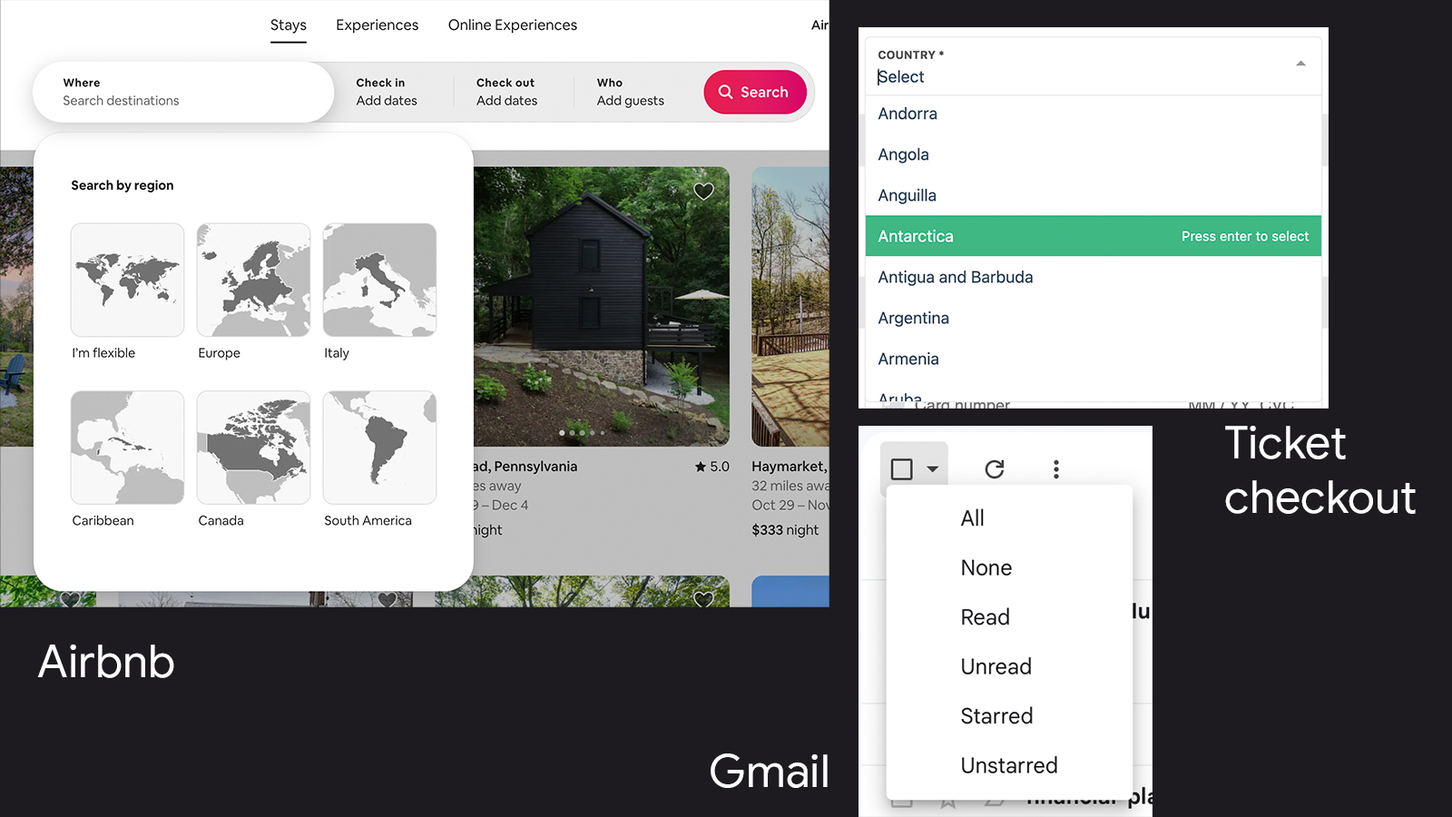
select v2A selectable list of options you can fully customize, with both style and content, building on the existing select element
Stylable, accessible dropdowns are coming!!!
Where
Search destinations
I'm flexible
Europe
Italy
Caribbean
Canada
South America
<select class="country-select">
  <button>
    <selectedoption></selectedoption>
  </button>
  <datalist>
    <option value="" hidden>
      <p>Select a country</p>
    </option>
    <option value="andorra">
      <img src="../Andorra.svg" />
      <p>Andorra</p>
    </option>
    <option value="bolivia">
      <img src="../Bolivia.svg.png" />
      <p>Bolivia</p>
    </option>
    ...
  </datalist>
</select>
/* Fallback for older browsers */
<select class="country-select">
  <button>
    <selectedoption></selectedoption>
  </button>
  <datalist>
    <option value="" hidden>
      <p>Select a country</p>
    </option>
    <option value="andorra">
    <img src="../Andorra.svg" />
      <p>Andorra</p>
    </option>
    <option value="bolivia">
    <img src="../Bolivia.svg.png" />
      <p>Bolivia</p>
    </option>
    ...
  </datalist>
</select>
Scroll-driven animations
view-timelineanimation-timelineview()
@keyframes fly-in {
  0% {
    opacity: 0;
    transform: translateX(-100px);
  }
  50% {
    opacity: 1;
    transform: translateX(0px);
  }
}

blockquote {
  animation: fly-in auto linear;
  animation-timeline: view();
}
scroll-driven-animations.style
...speaking of animations...
View Transitions
view-transition-namedocument.startViewTransition()
Discrete animations
document.querySelectorAll('.delete-btn')
  .forEach(btn => {
    btn.addEventListener('click', () => {
      btn.parentElement
         .classList.add('fade-out');
    }
  )
})
View transition (default)
document.querySelectorAll('.delete-btn')
  .forEach(btn => {
    btn.addEventListener('click', () => {
      if (document.startViewTransition) {
        document.startViewTransition(() => {
          btn.parentElement.remove();
        });
      } else {
        btn.parentElement.remove();
      }
    }
  )
})
Stronger resilient components
:has() relational selectorStyle parent elements (and more) based on the presence or state of child elements
Aug 2022
Mar 2022
December 2023
:has() relational selector
This figure doesn't have a figcaption. Lorem ipsum dolor sit amet consectetur adipisicing elit. Eveniet ipsam, ad delectus doloremque blanditiis in incidunt numquam eum ullam ut quo porro vel soluta deleniti rerum reprehenderit quae aliquid quos.
Chromium logo
This figure does have a figcaption. Lorem ipsum dolor sit amet consectetur adipisicing elit. Nostrum, aut. Minima natus nulla, dicta, quasi autem a architecto, earum explicabo molestias illum eum rerum magni! Harum sequi cumque quia expedita.
Quantity Queries
Style based on the number of children
:has(:nth-child(n + x))
Hair: Harry Potter
Makeup: Mark Zuckerberg
Styling: Mary Poppins
Hair: Harry Potter
Makeup: Mark Zuckerberg
Styling: Mary Poppins
Accessories: Marie Claire
Photographer: Beyonce
Photography Assistance: Leonardo DiCaprio
                  @supports selector(:has(a)) {
  .post {
    display: none;
  }

  .filter-bar:has(#css-tag:checked) ~ .posts .post:has([data-tag="CSS"]),
  .filter-bar:has(#html-tag:checked) ~ .posts .post:has([data-tag="HTML"]),
  .filter-bar:has(#js-tag:checked) ~ .posts .post:has([data-tag="JavaScript"]),
  ... {
    display: block;
  }
}
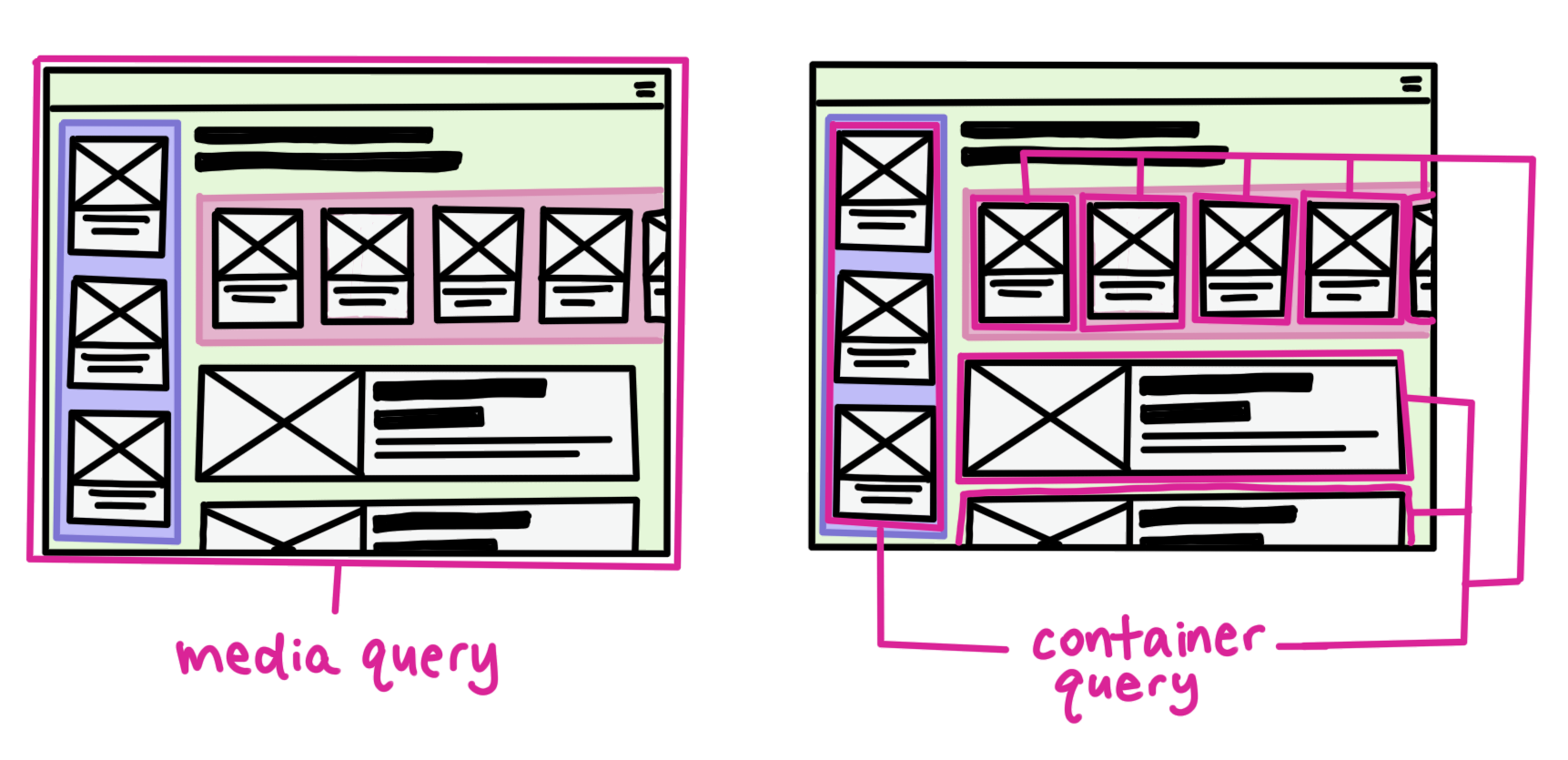
Container Queries
container-typecontainer-name@container
Aug 2022
Sept 2022
Feb 2023
Container query units
Fluid Typography
And don't forget... @property
Aug 2020
Mar 2023
Nightly
@property declaration
                    @property --colorPrimary {
  syntax: '<color>';
  initial-value: magenta;
  inherits: false;
}
@property Typed CSS
                    .card {
  background-color: var(--colorPrimary); /* magenta */
}

.highlight-card {
  --colorPrimary: yellow;
  background-color: var(--colorPrimary); /* yellow */
}

.another-card {
  --colorPrimary: 23;
  background-color: var(--colorPrimary); /* magenta */
}
@property --gradPoint {
  syntax: '<percentage>';
  inherits: false;
  initial-value: 40%;
}

.post {
  background:
    linear-gradient(var(--color1) var(--gradPoint),
                    var(--color2) calc(var(--gradPoint) + 20%));
  transition: --gradPoint 0.5s;
}

.post:hover, .post:focus {
  --gradPoint: 100%;
}
Went Stable Cross-browser recently
Media Query Range Syntax
Old
@media (max-width: 400px) {
  ...
}

@container (min-inline-size: 300px)
       and (max-inline-size: 599px) {
  ...
}
New
@media (width <= 400px) {
  ...
}

@container (300px <= inline-size < 600px) {
  ...
}
HD Color & Color Functions
CSS Nesting
This:
.card {
  /* card styles */
}

.card  .title {
  /* element styles */
}

.card:hover {
  /* modifier styles */
}

.card:focus {
  /* modifier styles */
}

@container (width >= 300px) {
  .card {
    /* CQ styles */
  }
}
Becomes...
.card {
  /* card styles */

  .title {
    /* element styles */
  }

  &:hover, &:focus {
    /* modifier styles */
  }

  @container (width >= 300px) {
    /* CQ styles */
  }
}
Subgrid
🤫 This presentation is fully built with vanilla CSS & HTML*
*with some iframes for demos due to laziness
<style> with display:block and contenteditable
Smooth scroll with scroll-snap
Navigation with HTML accesskey
ctrl + opt + 1 = Better UI Capabilitiesctrl + opt + 2 = Animating popoversctrl + opt + 3 = Anchor positioningctrl + opt + 4 = Selectlistctrl + opt + 5 = Faster Interactionsctrl + opt + 6 = View Transitions...
ctrl + opt + e = This slide
Another cool thing...
CSS & HTML work in every framework
Leverage the power of the browser
Reduce complexity, improve velocity
Stay in the know
web.dev
developer.chrome.com
Thank you!
Find me on the internet!
Twitter: @una
Website: una.im
Mastodon: front-end.social/@una