The Basics
So, what is the Sass &? Well, it’s a lot of things — but it’s basically is a way to merge selectors. The parent element takes the place of the ampersand. The best way to understand it is to see some examples:
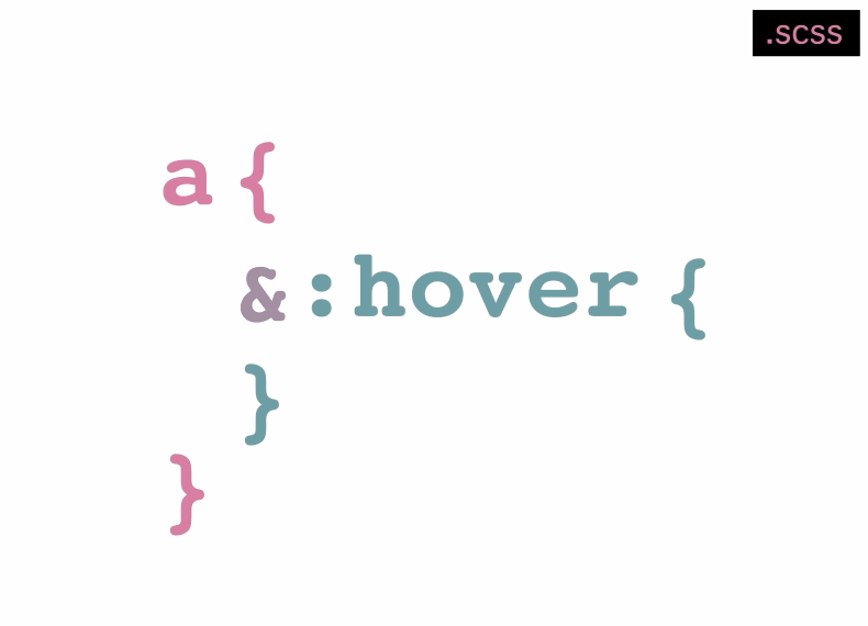
SCSS
.unicorn {
  background-color: blue;
  &:hover {
    outline: 2px solid yellow;
  }
  &.pink {
    background-color: pink;
    &wat {
      color: red;
    }
    &:hover {
      outine: 2px solid green;
    }
  }
}
CSS Output
.unicorn {
  background-color: blue;
}
.unicorn:hover {
  outline: 2px solid yellow;
}
.unicorn.pink {
  background-color: pink;
}
.unicorn.pinkwat {
  color: red;
}
.unicorn.pink:hover {
  outine: 2px solid green;
}
See how it just combines whatever phrase you insert after the & directly onto the end of its parent. This is great for element states such as hovers, and for focusing on specific elements. It works with pretty much anything now (as of the 3rd release candidate of Sass 3.3) (i.e. .unicorn { &wat { ... } } became .unicornwat { ... }. It’s a great too for BEM syntax (see ‘A Much Simpler @at-root’)!
The Trailing Ampersand
The trailing ampersand does the same thing as the prepended one — it switches out with the parent element when outputted. Why would you use one? Well its a great organizational tool, and its awesome to use in mixins. Here are a few examples:
SCSS
.unicorn {
  .set-one & {
    display: none;
  }
}

.button--large {
  .sidebar & {
    font-size: 80%;
  }
}
CSS Output
.set-one .unicorn {
  display: none;
}

.sidebar .button--large {
  font-size: 80%;
}
Another use for the trailing ampersand is in mixins. It would take the parent element (aka whatever you use the mixin on) in place of the ampersand. Joel Oliveira wrote an awesome example. Here’s another one:
SCSS
@mixin highlight() {
  color: coral;
  .sub-nav &,
  .active &,
  .sidebar &  {
    background-color: gold;
  }
}
li a { @include highlight; }
CSS Output
li a {
  color: coral;
}
.sub-nav li a, .active li a, .sidebar li a {
  background-color: gold;
}
In this example, all of your list links are coral with no background color except for ones within your ‘sub-nav’ class, ‘active’ class, or ‘sidebar’ — they get a gold background.
A Much Simpler @at-Root
As mentioned earlier, the Sass Ampersand just got even cooler. With the recent release of Sass 3.3.0rc3, basically everything from this post on BEM & at-root outdated (**however, @at-root will still be usable in the release of Sass 3.3). The concepts are the same, but now, instead of prepending with @at-root #{&}, one simply needs to use a &- or &_. Previously, &- or &_ or even &words would cause error, but this fix is really awesome :)
Previous Markup (Sass 3.3rc1)
.speech-bubble{
  color: purple;
   @at-root #{&}__header{
    color: orange;
  }
   @at-root #{&}__text{
    color: black;
     @at-root #{&}--link{
      color: green;
    }
  }
}
New Markup (Sass 3.3rc3)
.speech-bubble{
  color: purple;
   &__header{
    color: orange;
  }
   &__text{
    color: black;
     &--link{
      color: green;
    }
  }
}
The result (CSS Output)
.speech-bubble{
  color: purple;
}
.speech-bubble__header{
    color: orange;
}
.speech-bubble__text{
    color: black;
}
.speech-bubble__text--link{
      color: green;
}
The Double Ampersand
This fun trick by Guil Hernandez of Treehouse, is also pretty cool. He combines ampersands with the CSS adjacent sibling combinator — aka the +. The + is used to target an element’s immediate sibling (i.e. an image or subtitle immediately following an h1). For instance, you can use this in styling blog posts — where that first image could always be the author, and may need its own unique style.
My favorite example of his is for columns. If you have two, using the double ampersand can really come handy.
SCSS
.column--half {
  color: dimgrey;
  & + & {
    margin-left: 30px;
  }
}
CSS Output
.column--half {
  color: dimgrey;
}
.column--half + .column--half {
  margin-left: 30px;
}
This gives both of the ‘column—half’ class elements the same color (dimgrey), but only the second ‘column—half’ element will get the left margin. The first one will flush left of the page.